The Mental Model - Before You Write a Line of CSS 3D
Build the foundational theory for CSS 3D, including the coordinate system, perspective, and the vanishing point, before writing any code.
Part of the series: Unlocking CSS 3D
- Part 1The Mental Model - Before You Write a Line of CSS 3D
- Part 2The Foundation - Mastering 2D Transforms
- Part 3Entering the Third Dimension - The Flipping Card
- Part 4Assembling a 3D Object - The CSS Cube
- Part 5The Final Polish - Interactivity, Lighting, and Performance
- Part 6The Real World - Practical 3D Components
Welcome to the official start of Unlocking CSS 3D. In this series, you will build incredible, interactive 3D experiences. But the most powerful tool in this journey isn't a CSS property or a JavaScript function—it's a robust mental model.
Most tutorials rush you into code. They show you a recipe to build a flipping card, but you walk away only knowing the recipe, not how to cook. This article is different. This is our "mise en place"—we are preparing our minds. Here, we will build the foundational concepts of 3D space. Master the ideas on this page, and the code you write in the articles to come will feel like a natural, logical extension of what you can already see in your mind's eye.
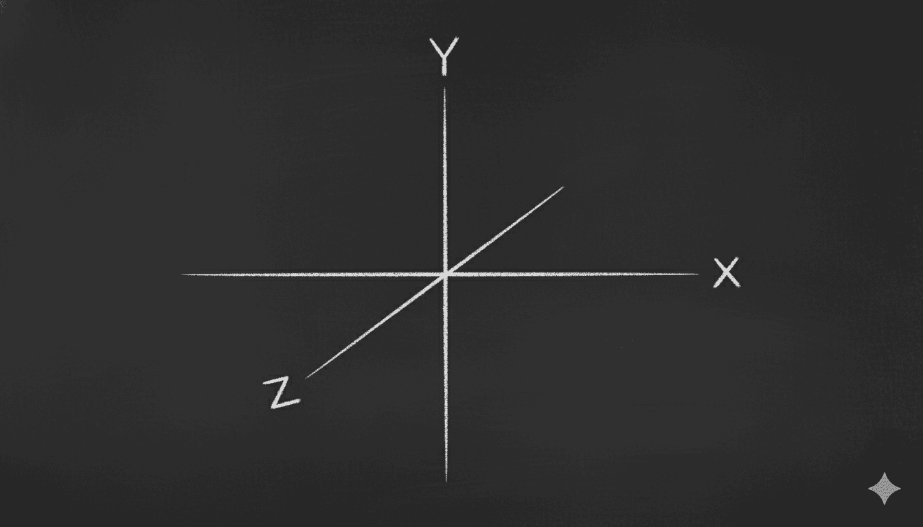
Meet the Third Dimension: The Z-Axis
Your entire career as a web developer has been spent on a flat plane defined by two axes:
- The X-axis runs horizontally, left to right.
- The Y-axis runs vertically, top to bottom.
Now, imagine a third axis, the Z-axis, that runs perpendicular to your screen. It emerges from the center of your monitor and points directly at you.
This is the axis of depth.
A positive Z value, like transform: translateZ(100px), moves an element "out of the screen," making it appear closer to you.
A negative Z value, like transform: translateZ(-100px), pushes an element "into the screen," making it seem farther away.
The Z-axis is the fundamental building block of every 3D effect you will ever create.
The Illusion of Depth: Why perspective is Everything
Here's a critical paradox: if you apply a translateZ to an element on a default webpage, you won't see it move closer or farther away. You'll just see it scale up or down.
This is because the browser, by default, is a flattening engine. It takes all your elements and renders them onto a single 2D plane. To break free from this, we must explicitly create a 3D rendering context. We do this with the perspective property.
Think of perspective as the simulated distance from your eye to the computer screen. It is the property that creates the powerful illusion of depth.
Crucially, perspective is applied to a parent container, not the 3D element itself. This parent becomes the "scene" or the "stage" where your 3D objects live.
- A low
perspectivevalue (e.g.,[perspective:250px]) is like having your face pressed up against a window. Objects very close to you will appear huge and heavily distorted, while objects further away shrink rapidly. The 3D effect is dramatic, intense, and often feels like a wide-angle or fisheye lens. - A high
perspectivevalue (e.g.,[perspective:2000px]) is like viewing the scene from far away. The difference in size between near and far objects is much less pronounced. The 3D effect is subtle, flattened, and more isometric, like a view through a telephoto lens.
A value between 800px and 1200px is often a great starting point for natural-looking 3D effects.
Interactive Playground: The Perspective Simulator
Objective: Feel the direct impact of the perspective value on an object in 3D space.
Code for the Playground Component:
'use client';
import { useState } from 'react';

export const PerspectivePlayground = () => {
  const [perspective, setPerspective] = useState(1000);

  return (
    <div className='w-full bg-white dark:bg-slate-800/50 p-8 rounded-lg border border-slate-200 dark:border-white/10'>
      <div
        className='w-full h-48 flex items-center justify-center'
        style={{ perspective: `${perspective}px` }} // Apply perspective to the parent
      >
        <div className='w-40 h-24 bg-cyan-500 flex items-center justify-center rounded-md text-slate-900 font-bold [transform:rotateY(45deg)]'>
          I am in 3D
        </div>
      </div>
      <div className='mt-6'>
        <label
          htmlFor='perspective'
          className='block text-sm font-medium text-slate-700 dark:text-slate-300'
        >
          Perspective: {perspective}px
        </label>
        <input
          id='perspective'
          type='range'
          min='200'
          max='3000'
          value={perspective}
          onChange={(e) => setPerspective(Number(e.target.value))}
          className='
            w-full h-2 rounded-lg appearance-none cursor-pointer
            bg-slate-200 dark:bg-slate-700
            [&::-webkit-slider-thumb]:appearance-none
            [&::-webkit-slider-thumb]:h-4
            [&::-webkit-slider-thumb]:w-4
            [&::-webkit-slider-thumb]:rounded-full
            [&::-webkit-slider-thumb]:bg-cyan-500
          '
        />
      </div>
    </div>
  );
};
Below is another demo that shows how perspective affects the view. scroll the below demo along with adjusting perspective using the slider.


The Vanishing Point: Where Everything Converges
When you set a perspective on a container, you implicitly create a vanishing point. Just like looking down a long, straight road, where the sides of the road appear to meet at a single point on the horizon, all objects in your 3D scene will appear to converge towards this central point as they move further away from you.

By default, the vanishing point is located at the exact center of the container that has the perspective property. You can change this with the perspective-origin property, but for now, we'll stick to the default.
This leads to the final, crucial rule of our mental model:
An element's perceived size is a ratio between its translateZ value and its container's perspective value. An element with transform: translateZ(-1000px) inside a container with [perspective:1000px] will shrink to a single point, effectively reaching the vanishing point and disappearing.
Key Takeaways
This is the entire theoretical foundation. Before you proceed, ensure these three concepts are firmly locked in your mind:
- The Z-Axis: The axis of depth, running perpendicular to the screen. Positive is closer, negative is farther.
- Perspective: The property that creates the illusion of depth. It's applied to the parent container and represents the "viewer's distance" from the scene.
- The Vanishing Point: The central point where all receding objects appear to converge. Its location is determined by the
perspectiveproperty.
With this mental model in place, you are no longer just a developer placing boxes on a screen. You are a director, positioning objects on a 3D stage.
In our next article, we will get our hands dirty with code. We will master the foundational 2D transforms in Tailwind CSS, which are the essential building blocks for everything that follows.